THE ASK
Our team was approached by the Barclays business stakeholders that wished to increase our customers’ understanding of the benefits they could earn by utilizing the Barclays Arrival Premier World Elite Mastercard. The brief from our business stakeholders requested that the newly updated page be ‘innovative, immersive, and disruptive’.
From the graphic below on the left, you can see in the original design that the information about the credit card’s benefits was mashed together, into a tight, difficult-to-comprehend, crowded landing page.
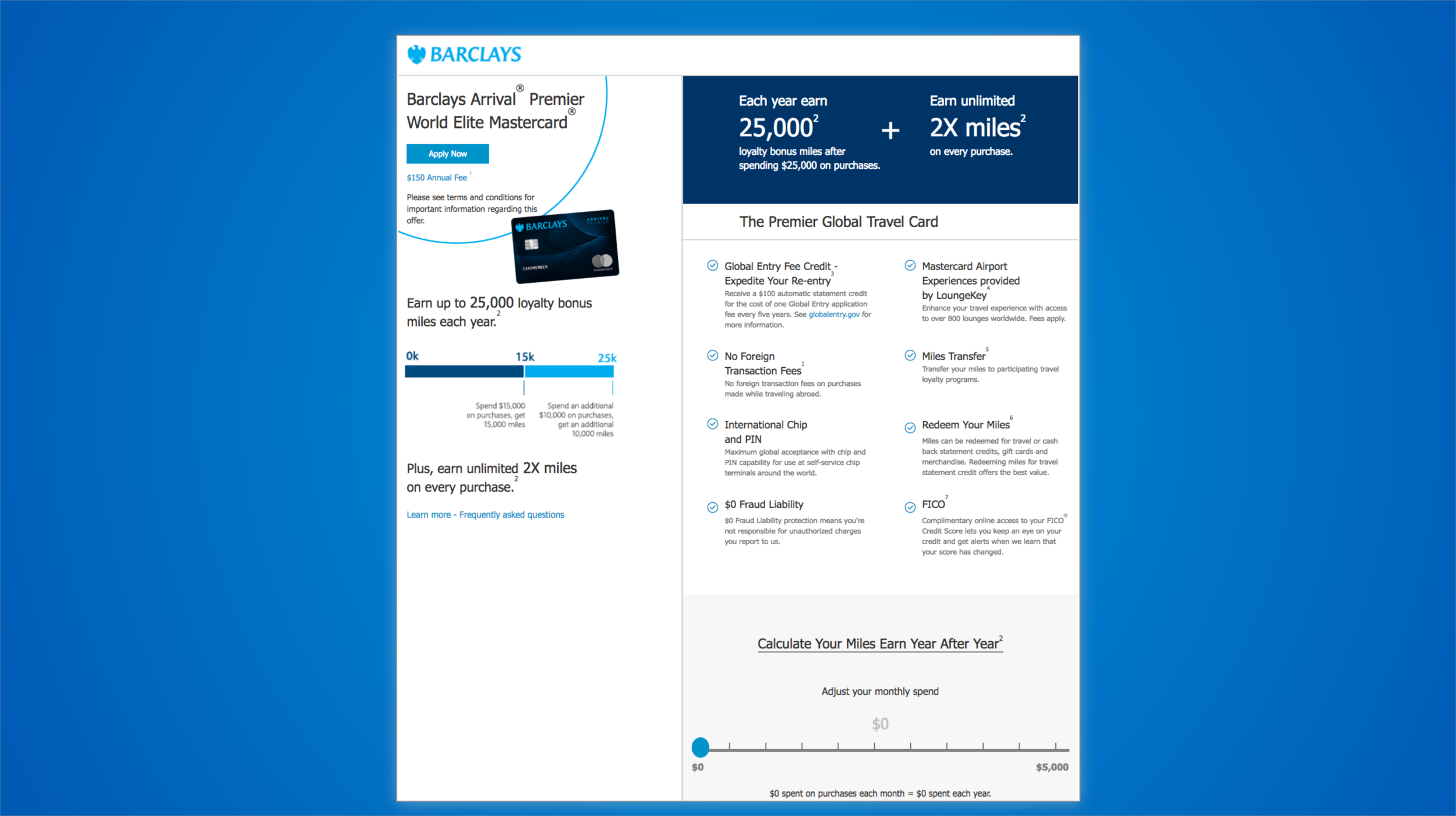
I began my redesign by prioritizing the information that I wanted the customer to view and interact with first. I sketched some really low fidelity wireframes that would take these puzzle pieces (highlighted in different colors above on the right) to be shaped in a way that would tell a narrative of the benefits of the card, erase the confusion of what information to focus on, and help alleviate the friction of the math behind the benefits. Due to legal reasons, all of the information on this page had to be in the redesign, and so a main design constraint was maintaining needed information while also streamlining and simplifying the page.
To frame the problem and design a solution I asked myself several questions from the user’s perspective. What is the most important piece to highlight here? What should the customer pay attention to first? Is it the info about the points, or the neat bar that demonstrates a benefit threshold? And what can be done about the slider? What output will engage the user and how will the output be visualized?
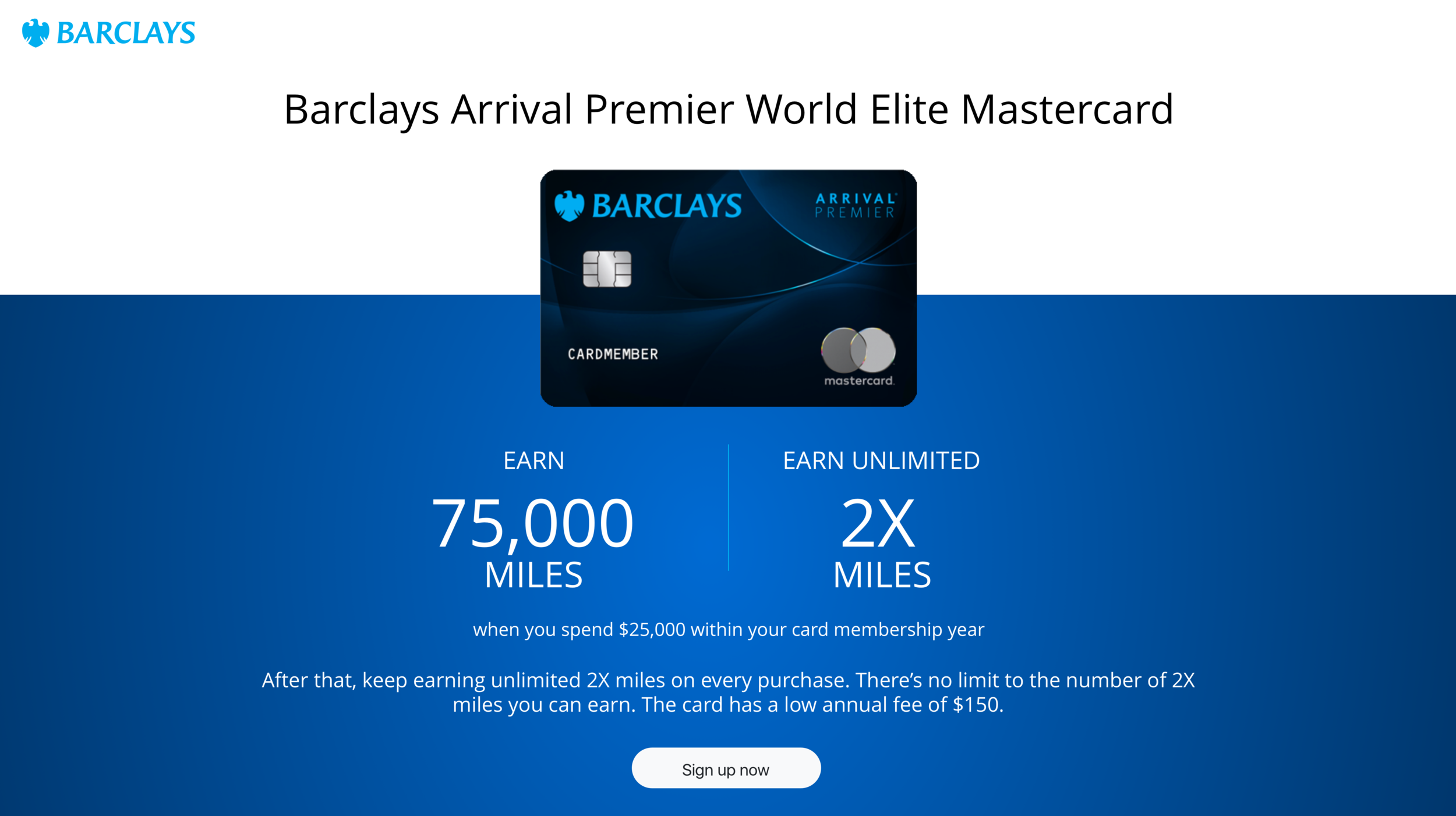
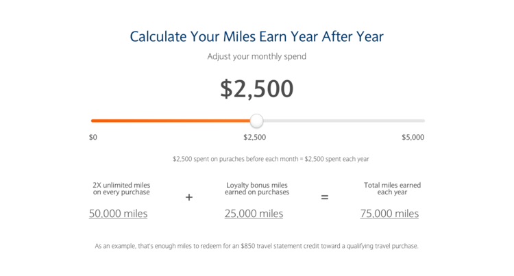
The selling point of the card was the high amount of travel miles the customer could earn, including bonuses at certain spending thresholds. I used typography that was bold, large, and inviting to clearly articulate these key points to the customer.

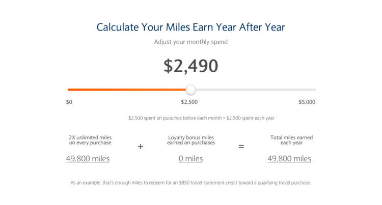
Right below the card art, the bold copy about the benefits, and the call to action, I designed a slider that would calculate the benefits of the credit card for the user. Instead of asking the customer to do mental math about how all the benefits would add up, and when the points thresholds would kick in, I wanted to show, in real time, the mathematics behind the spending.
In my redesign below, I provide the customer with an interactive tool that visually quantifies the card’s benefits depending on how often it is used. I not only wanted to show the final tally of the points, but also how the thresholds work, and at which point the customer could see those ‘breakthroughs’ to bonus rewards. When he/she would cross the “$25,000” spend line, the “Loyalty bonus miles” would be added on top of the base rewards as a bonus. The animations would highlight the amazing and exciting opportunity. Most consumers have credit cards from multiple issuers, so the design is meant to educate the customer on the opportunity for higher rewards and incentive brand loyalty to the Barclay Arrival Premier card.
And finally, at the very bottom, I included the quick snapshot benefits. I designed an airy feel for these bulleted points so as to efficiently give the customer an understanding of other reasons to sign up for the credit card without overloading them with information. These benefits are not as marketable as the thousands of travel miles, but they are very beneficial to a large portion of our target demographic (i.e. frequent international travelers).

Impact
This redesign offered our users a more frictionless, modern, and bold experience. The new digital customer experience also aligned the colors, elements, and typography of the Arrival Premier card landing page with the new Barclays unified brand standards, which was an overarching corporate design goal for all Barclays products and services. The end result was an engaging and seamless user experience that clearly articulated the value proposition to the customer, which ultimately leads to improved brand loyalty and business performance for Barclays.
